Showing posts with label Practical Scrappers. Show all posts

Wednesday, March 31, 2010

Practical Scrappers DT Challenge: Use Rub-ons

This week's challenge at Practical Scrappers is to use rub-ons - something that I, admittedly, am NOT a fan of. I bought some to use for the challenge and didn't end up having time to create a layout around the rub-ons - which is what I would have to do in this case. I had been working on scrapbook layouts with non-scrapping friends last week. We started on Monday and needed an entire book done before Friday - it was a moving away gift for a family that are dear friends of mine and Will (the husband) was leaving on Tuesday morning, so his surprise going away party was on Friday night.

On Friday while working on a "Friends" page and cooking up a huge batch of gumbo for the party, I decided to use some old rub-ons that I've had for a while on the layout, which I was able to submit as my project. Talk about getting it done on the 11th hour!

Here is my 2-page layout "You've got a friend in me".

Left page:

here's the right page:


The left page has an oversized tag cut from tags, bags, boxes and more. I printed the lyrics to the Randy Newman song "You've got a friend in me" (we all know it from Toy Story) and used that as the journaling tag. I knew this going away party was going to be emotional and our friend Will needed something to remind him of his friends here in Florida. I didn't want the journaling to be too personal - he's a tough guy, so I opted for this song. The photos on the layout were from various times we all spent together at a bar where Will's wife (and one of my best friends) Krissy works. My boyfriend plays guitar and sings there on Sundays so the music theme seemed appropriate. It went over well - and there were a lot of tears.

On the lower right corner of the left page, there is a mini album, which is held closed by sheer yellow/gold ribbon tied in a bow. It's folded accordian style and houses 7 photos between the 2 sides of the pages. Here's a close-up of it opened:


The right page also holds a bunch of photos, but this time I used a tag holder that I find quite handy, unique and fun! I've used both of these multiple photo LO techniques on a previous layout (Emily the Destroyer) but both LOs look so different - it's just a great way to get a lot of photos on a 2-page spread.

The tag holder was made from a #10 business size envelope that was folded, inked, & covered with coordinating paper. It holds 4 tags and each has a photo on both sides. I discovered this technique by visiting Following the PaperTrail. Laura has a lot of very cool things on her blog... check her out when you get a chance. You won't be disappointed! Here's a link for a YouTube video with directions on how to make the tag holder.

Here's a close-up of horizontal tags that slide into the tag holder:


and here is a close-up of the vertical tags that slide into the top of the tag holder:

Keep in mind, more tags can be added, I just chose to have 4 double-sided photo-tags for this layout. The final photo count on this 2-page layout: 18! Had I chosen to make the journaling tag a lot smaller I certainly would have been able to include at least 1 more photo on that page. In fact this layout had the potential to hold well over 20 photos without crowding them all in - gotta love that! I used Great Big Brads from Hot off the Press with quirky little HotP rub-ons on 2 of the photo tags and 1 on the journaling tag. The tags were all distressesd with Tim Holtz distress inks (spiced marmalade & dried marigold).

The striped paper was from Reminisce. It's double sided - the quilt-pattern you see under the vertical tags is on the reverse side.

Title letters were cut from Alphalicious, the music notes were from Hannah Montana and the tags were all TBB&M.

That's it for this week. I'll be celebrating my birthday this weekend so hopefully I'll have a few funny pictures to scrap in the coming weeks. My mom is doing her annual Easter Egg hunt on Sunday for the kids so there's another photo-op!

Thanks for visiting my blog and be sure to check out Practical Scrappers to see the great rub-on projects my DT sisters have created this week.

Til next Wednesday...

Happy crafting,
Barb

Wednesday, March 24, 2010

Practical Scrappers DT Challenge: Use something that you've had in your stash for over a year

Spring is here so it's time to clean out your storage bins & drawers, dust off those packages of stickers that you HAD to have but never used and use up those patterned papers that you've been holding on to for that special page!

This week Practical Scrappers wants you to dig into that stash and use something that you have had for over a year. It can be a product or tool and you only need to use one item to qualify. The Grand Prize winner will receive two free digi stamps from The Stamping Boutique. The deadline to enter is 5 p.m. on Saturday, so hop on over to Practical Scrappers and submit your project. My Design Team sisters and I would LOVE to see what's been hiding in your stash!

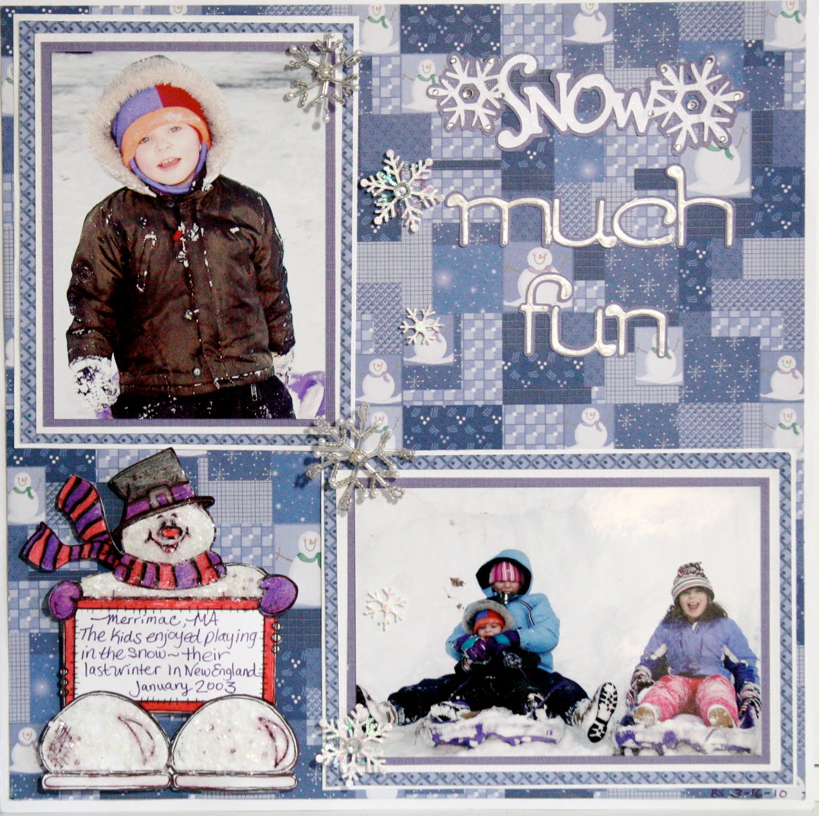
Here's my "Snow Much Fun" layout for this week:

I have had these papers from Hot Off The Press' "Mixing Christmas Papers" since 2002 and it's really great to use them! I wanted to bring in a little purple from the photos and the patterned paper so I matted the 2 photos in purple, then white, then a coordinating HotP paper from the same collection and finally another white mat. I felt that because the geometric pattern on the paper was so busy, the quadruple mats helped to tone it down, while still tying it together.

The glitzy snowflakes cascading down the layout are from Jolee's Boutique - another item that has been floating around in my stash since about 2003. I love how well the silver & pearl beads and clear rhinestones play with the cool blues and purples of the papers.

Because this month's sponsor is The Stamping Boutique, the DT members all were asked to use a digi stamp on a card or layout during the month. I chose an adorable Snowman Scrapbook Journal, which helped me do another snowy layout from our old home in New England. I colored the happy fellow with colored pencils, then applied Glossy Accents on him. While the Glossy Accents was still wet, I sprinkled a healthy dose of Martha Stewart Crafts "Snow" glitter all over to give him a frosty look. This glitter is a lot chunkier than normal glitter so it does look like ice crystals - take a closer look:


After the first coat of glossy accents dried, I applied more to his hat, scarf & mittens as well as along the exposed edges of the journaling block and the bottoms of his feet. I cut the entire digi stamp out and used 3d foam dots to affix him to the page.

The title letters ("Much Fun") are from the Tear Drop Cricut cartridge and were welded using my Gypsy and "Snow" is from Gypsy Wanderings. I applied Liquid Pearls White Opal (I've had since '08) to the tear drop letters and Distress Rock Candy Stickles to the "Snow" title. I also added some additional rhinestone bling on the snowflakes for a little extra sparkle.

I think I'm done with snowy layouts for a while. The sun is shining here in Southwest Florida and it looks like we're back to our normal 80 degree temperatures for a while... sounds like there may be a few beach days with my girlfriends along with some bright beachy layouts in the coming weeks!

I hope the sun is shining, the snow is melting, the rain has stopped and the crocuses are popping up where you are! Thanks for visiting my blog and...

happy crafting,
Barb

Friday, March 19, 2010

Practical Scrappers Sketch Friday (March 19)

This week's sketch at Practical Scrappers comes from the very talented Ann-Katrin. I LOVE her work!!! Here is her sketch:


And here is my "Rock Out' layout based upon her sketch:


I did take some artistic freedom with the sketch as you can tell... I omitted the horizontal and vertical paper strips because it just wouldn't work with my background paper (DCWV "Rockstar Stack") or my Cricut cuts.

The entire layout was designed and welded in Cricut DesignStudio, which made placement of the photo and all of the paper-pieced die cut layers SOOOOOO simple and precise! I used the Hannah Montana Cricut cartridge for the funky guitar and the word "ROCK", George and Basic shapes for the photo mat, Home Decor and Home Accents for the swirls. and Black Letter for the letters "OUT". You may not be able to see in the picture but I inked the edges of the "Rock Out" letters with "Tattered Rose" Distress Ink and the guitar with "Broken China" Distrss Ink. I love the contrast between the tattered rose and yellow CS (in real life).

The photo is my DD Alyssa when she was about 4-years-old... she's going to be 17 next month - Guess I'm a little behind on my scrapping, LOL!

Thanks Ann-Katrin for another AMAZING and INSPIRING sketch layout. I can't wait to see what you come up with next, and thank YOU for visiting my blog. Please leave a comment and become a follower, if you are not one yet!

Thanks and happy crafting,
Barb!

Wednesday, March 17, 2010

Practical Scrappers DT Challenge: Use Chipboard

This week's challenge at Practical Scrappers is to use Chipboard. I had originally planned to submit my Cruise word book, but I didn't have the photos that I needed to complete the book in time. The layout below is my "Plan B":


I have a confession to make... I'm not a huge fan of manufactured shaped chipboard pieces. I own a lot of it, in fact, I have a lot of these Technique Tuesday full sheet sets, but I can't seem to take them out of the packing and use it. This wave has been floating around my craft room forever!

I used acrylic paint to cover the large wave from Technique Tuesday's "FUNdamentals of Water" Chipboard
in my layout above, then added Dimensional Magic to give it some shine. Before it was dry, I added some clear glass beads to replicate bubbles.

The chipboard piece in the upper left corner is also from Technique Tuesday. I inked the outside frame, stamped the "Life's a Beach" on the inside and then traced over the stamped words with Stickles.

The date tag was made from leftover chipboard using a template that I made from tags, bags, boxes and more and my Cricut. I inked the edges, used Stickles to write the date and then attached fibers to the ends to anchor the tag on my layout.

The paper is one of my favorites... it's from Flair Designs and it's called "Paradise Found" - fun, fun, fun!!!

Thanks for visiting and...

Happy crafting,
Barb

Tuesday, March 16, 2010

Cruise Word / Shape Book

I am submitting this Word / Shape book as an additional Practical Scrappers project for the Chipboard Challenge:


This is a book that I made for my Cricut DesignStudio 102 class that I will be teaching later this month at Scrapbooking Goodies in Cape Coral FL. In this 2-part class, I will be showing students how to create their own unique word / shape book. This is an example of one of the many different formats that they can use and I will have other types on display at the store so they can decide which type they would like to make.

The cardstock is all Core'dinations and I chose that because of it's thickness - something that I think is very important for these shape / word books. I used recycled cereal boxes and Pepsi can 12-pack boxes for each page, spraying each piece with Archival Mist to make it acid free. Each page was cut twice from CS and once from the recycled box "chipboard".

The first page is the welded title letters for the book - in this example "Cruise". I used George for the rectangle on the left side of the page, and Life is a Beach for the letters and wave. I used a new type of Core'dinations for the wave - "Gemstones"... be sure to look for these beauties at your LSS!


The second page is pockets that hold tags that I made from tags bags boxes and more and my ship credit card. You may not be able to tell from the photo but there are actually 2 rows of pockets. The back side of every page (not shown) also have "Gemstones" waves that act as a pocket for photos or tags.

Page 3 is a cruise ship from Life is a beach (LiaB). Simple page, no real plans for photos or journaling, but they could be added.


The next page is dolphins from LiaB - again, nothing special here except flipping an image, adding some welded circles & rectangles so there isn't so many cut-out areas and basic layering / paper-piecing. I wanted more uncut areas on the back to hold more pictures / journaling tags.

Here are the happy dolphins:


I decided to add a full page after the dolphin page with a beach and palm tree. The "beach" is another pocket. If you look closely you will see a new product that I just had to try - Mudd Puddles! You can get more information from their website, but it is pre-mixed glue and sand that you spread with a knife on your project, just like frosting a cake. Once it is dry, it will not crack, flake, or peel off and it's extremely flexible PLUS it's acid-free... very cool stuff!

I used 2 different colors on this page: Malibu (sand) and Marine (water).


Finally on the last shape page I used more Mudd Puddles on a sandcastle cut from Everyday Paper Dolls. This time I chose "Bahama Beach" sand and after it dried, I inked the edges with some walnut stain distress ink applied to a fantastix, as well as adding a few faux shadows on the turrets and towers.


To finish the book off, I ended with a blue full page that I can adhere photos to.

Thanks for visiting my blog. Please leave a comment and let me know what you think about my book.

Happy crafting,
Barb

Wednesday, March 10, 2010

Practical Scrappers DT Challenge: Use a white pen

This week Practical Scrappers wants you to get out your white pens/markers and use them. They will have a Grand Prize Winner again that will get two digi stamps from The Stamping Boutique.

My personal favorite white pen is Inkssentials Opaque Pen (I use them quite often) and this week I had a lot of fun doodling with it.

Here's my DT submission for this week - "Snow Day"


I have to thank my boyfriend Tom's Aunt Ann for sending him some spectacular winter photos from her home in New Jersey. As soon as I saw this photo, I knew I had to scrap it. Growing up in southeast New Hampshire and moving to northeast Massachusetts as an adult, I remember storms like this well and to be honest, I was never a big fan of snow. I remember always thinking as a child that my parents were living in the wrong part of the country. Watching Rex Trailer's "Boomtown" every weekend and hearing all about the wonderful February Vacation trips to Florida with Rex that our family could never afford (one of the show's sponsors was a travel / tour company) convinced me that I should have been born in Florida. 30 years later I finally made it "home" to Florida where we never have to shovel snow. I've often said scenes like this photo are perfect - in a postcard or a calendar, but now I think they're best in a scrapbook layout!

Back to my layout... The cardstock I chose to use is Core'dinations Black Magic Amulet, Whitewash Cellar Door, and Core Essentials Marine Blue.

Starting with the black magic, I sanded the edges to reveal the "Amulet" blue core color. I matted the photo on white CS which I then placed on a larger piece of Marine Blue that I had added torn and layered peices of whitewash cellar door. I love how the blue torn edges give the effect of piles of snow! I decided to overlap a torn piece of the whitewash on top of the photo to tie it all together.

After adhering the oversized photo mat on to the black magic CS, I doodled icicles on the top edge of the mat. When I was happy with their appearance, I added some Ranger Glossy Accents (LOVE THIS STUFF!) to give them more of an icy look. Because I didn't want the icicles just dangling there by themselves, I anchored them by applying Ranger Liquid Pearls in White Opal above them, replicating the snow on the roof. Below is a closeup of how that looks. Notice that the Liquid Pearls is on both the mat and the background CS because I wanted a bumpy edge - just like snow drifts:


I used the white Inkssentials pen for my journaling on the right of the photo. I'm not thrilled with the way it came out, but because of the texture in the CS, it really couldn't have been much better. To add to the winter scene, I doodled random snow flakes on the black magic CS and added some doodled white dots to create the illusion of falling snow in the distance.

The large snow flakes were cut using the "When it's cold outside" seasonal Cricut cartridge and the title was cut from Winter Woodland cartridge. I added Distress Stickles in "Rock Candy" to the snowflakes, including the small one in the title, to further the glistening snow effect. I like the way Distress Stickles aren't as glitzy as regular Stickles...they have a subtle appearance yet offer a dramatic impact - well done Tim Holtz / Ranger! I added the large snowflakes to the layout using 3d foam dots for dimension:


Make sure you share your white pen / marker projects with us at Practical Scrappers. We'd love to see how you use these tools! And leave a comment here on my blog to let me know what you think of my icicles - it's been a while since I've seen real ones :)

Thanks for visiting my blog and...

Happy crafting,
Barb

Wednesday, March 3, 2010

Practical Scrappers DT Challenge: Use Inks or Chalk

Arrgggg me hearties and welcome t' me blog!

No I haven't been watching too much SpongeBob and I'm not practicing for "International Talk like a Pirate day". I'm just setting the mood for my Practical Scrappers Design Team Project: "Pirate Girls".

This week the challenge at Practical Scrappers is for you is use either chalks or inks (any kind of inks: alcohol, dye, pigment etc), and this month their sponsor is Stamping Boutique! One Grand Prize winner will receive 2 digital stamps of their choice. Check out Stamping Boutique to see what they offer and we look forward to seeing what you create!

Last week I mentioned how excited I was about this week's project - inks! If you had asked me a couple of years ago what I thought about inks I wouldn't have had much to say... I wasn't a huge fan. Well now I use ink on almost every project I create, especially Tim Holtz Distress Inks. I love how they can turn a piece of blah paper into something amazing. If you have never tried distress inks, I highly recommend checking out Tim's website and watching his demo videos. I bet you'll be running to your nearest LSS or craft store to pick up a few. But watch out... the colors are amazing, the look you'll get from these inks is fabulous and soon you'll be back buying every color available. I know... I'm now an "inkaholic", which brings me to my DT submission for this week:


The brown background paper is from HotP's "Leather" Papers. The name is deceiving because these papers just look like tanned and branded leather. I added to the leather-look by inking the edges with Walnut Stain distress ink. The burlap looking paper is from AdornIt Carolee's Creations "Western Collection" and is called "Heroes and Cowboys". I love looking for paper in unexpected sections of my LSS... I found this paper with farm/4H/horse papers, but I knew I wanted to use it for my pirate layout. The paper has words down the right side and some very light scroll designs in 2 corners, which the distress ink covers a bit. I tore the paper on two sides removing the words, then I made little slits along some of the edges to give the paper a frayed look. After I was happy with the shape, I used Tim Holtz Distress ink in Vintage Photo and Walnut Stain to give the edges a burned and aged appearance. The close-up below shows the details and how the inks really add character to the papers:


The title letters were cut with my Cricut using the Black Letter cartridge. If you like the look of that font, you better snag that cartridge quickly - Provo Craft recently announced it is retiring that Solutions Cartridge (and a few more!). I rubbed a little black ink on the letters to tone down the red cardstock just a little. While I'm talking about the red CS, if you notice the little scull and crossbones welded next to the "s" in "girls" you may see a hint of pink in the color. Being the silly girl that I am, I mistakenly cut it out of red when I was cutting the letters (d'oh!). Not wanting to waste paper (save the trees) I decided to cover it up with Tim Holtz Distress Crackle Paint in "Picket Fence". As it dried, the red from the paper bled into the paint, giving it a pink tone. Ok so what's a girl to do (still trying to use that cut!) with a pink skull??? Walnut Stain distress to the rescue. The ink covered enough of the color to make me happy while bringing out more of the cracks in the crackle paint. Problem solved.

That skull was cut from my Indie Art cartridge and there is also another skull on the lower right corner that was cut from Life is a Beach, coated with distress crackle paint and inked with Walnut stain, only I popped it onto 3D foam dots to make it stand out a bit.

My absolute FAVORITE part of this page is the tags...


Don't they look like aged leather with funky piratical words and images branded into them? Want that look? Grab some brown Bazzill Basics paper, the kind with just a tiny bit of texture yet still on the smooth side. I wish I knew what it's called but here's a close-up of what this texture looks like:


This is NOT the color that I used, which was actually a little lighter and I can't find more of it. If you know the name of this CS can you leave me a comment and let me know so I can run out a buy a stack of it? (hehehe!)

So back to my tags... the key to getting this look is to start with a non-stick craft sheet. Working with an ink blending tool, dab onto a walnut stain distress ink pad several times until you can see the ink on the foam, then gently rub in a circular motion beginning on the craft sheet and up onto the edge of the paper. You want to have a darker edge on the tag. Then as the amount of ink decreases on the blending tool, start to move a little further onto the tag to blend the ink with the paper. The subtle texture of this Bazzill CS allows the ink to kiss the bumps leaving just a trace of color. I added a lot of walnut stain to the edges to really age them. I used the same ink technique with the photo mat and small journal tags. The stamped images were from Inque Boutique Savoir Faire "Savvy" (Adventure, Treasure and the pirate ship on the large tag) and Stampendous (palm tree island, compass and treasure map). I used black Stazon to stamp the images and words on my tags. The tags were all cut from Tags, Bags, Boxes and More Cricut cartridge. The key and fibers were all from a HotP fiber pack.

Leave a comment and let me know what you think or if you have a question about these inks.

Thanks for visiting my blog and...

Happy crafting,
Barb

Wednesday, February 24, 2010

Practical Scrappers DT Challenge: Use Stamps

It's Wednesday so that means it's time for me to post another project for Practical Scrappers!

This week's challenge is Stamps! You can use any kind of stamp - digi, rubber, acrylic, foam - we want to see all of them! This week there will be a top three and a Grand Prize Winner. The Grand Prize winner will receive bonding powder and a Stampee foil of their choice. What's Stampee foil you ask? Go to Practical Scrappers and check it out - they are a brand new sponsor of ours and we are delighted to have them! PS will be featuring projects with Stampee Foil every day this week!

For my project, I decided to get my green on in anticipation of St. Patrick's Day and here is what I came up with:


The polka dot paper was from Hot off the Press. All the little Irish themed stamps were from Studio G. I stamped the images onto green CS with black Stazon, then heat embossed them with clear embossing powder. After I had enough of the little images stamped and embossed, I pulled out my trusty craft sheet, tapped a tiny bit of green Perfect Pearls onto it, then misted my craft sheet with water. I mixed the pearls and water, then painted inside the embossed areas - the embossing acts as a resist so it rolls right off the stamped image plus it also contains the pearly paint mixture inside the embossed lines... cool! I continued the process with white and gold Perfect Pearls until I had all the images painted. At this point I chose to hit the painted images with a heat gun just to speed up the drying but you can just let them dry on their own.

Here is a close-up of how shimery and fun the Perfect Pearls look:


I cut the images out in 1 1/4" squares then matted them onto 1 1/2" black squares. Now what would a St. Patrick's page be without a wee litte bit o' the gold??? I had some leftover gold coin confetti and matted 4 pieces onto green then black squares of cs, then alternated them with the stamped images onto a white strip of cs, which was also matted on black leaving just enough room above the blocks for a little journaling. Three of the stamped squares were adhered to the border with 3D pop dots and the gold coin blocks were just glued straight onto the border, adding a little variety.

I used 3d foam dots on the remaining 8 stamped images and put 4 on each side of the page giving the layout a very symmetrical look - very different for me!

The title letters were cut using my Cricut and San Serif cartridge, the shamrock was from Paper Doll Dress Up. To get the shading and shadows just right on the shamrock I went over the edges of the cut BEFORE removing it or the leftover paper from the mat with a fantastix loaded with black ink. This is such a simple way to achieve an inked edge look to any cut without having to try to run an inkpad over the edges. All you do is simply trace the cut with the fantastix until you get the desired look. I remove the image, check it to see if the ink covers the edges enough and if not, replace it on my mat where it was cut and add more ink. As the ink is removed from the fantistix, I like to blend the inked edges up onto the cut very subtly to give the cut a more realistic 3D look. I also use this technique to add shadows to my cuts, which you may be able to see on the right side and bottom of the shamrock's stem.

I'm very excited about next week's challenge at PS... but I can't tell you what it is yet! Make sure you come back and visit my blog next Wednesday and check out my DT challenge layout... I really LOVE it and am looking forward to sharing how you can get a very cool look using just a few supplies and some Bazzill CS.

Thanks for stopping by!

Happy crafting,
Barb

Wednesday, February 17, 2010

SOUS 2/12 Sketch - my first submission

So, I think I'm getting a little more confident with my work. I mean I LOVE my layouts and other people seem to like them too. I just have been hesitant in submitting anything other than my design team work... until today.

I recently saw this sketch on Stuck On U Sketches:


This is a direct quote from SOUS:
"This week we have chosen one created by Liz Qualman. You can visit Liz and see more of her work at http://lizqualman.blogpsot.com/. We hope you will come back next week for a VERY special treat from Liz to us for you! You won't want to miss it! But this week we have a little TWIST on the challenge. You must use the sketch AND you must use RED or PINK on your layout! It doesn't have to be valentine-ish... just use one of those colors somewhere on your project..."

As soon as I saw it I knew exactly what I wanted to do with it! I had this amazing photo of my youngest daughter and it was perfect for this sketch challenge!

Here is my take on Liz Qualman's sketch:


The patterned papers were from HotP (striped and polka dot), Doodlebug Design (checked) and the speckled is unknown :(

I used my favorite Cricut font cartridge Alphalicious for the title letters - it just adds to the playfulness of the layout, don't you think?

Practical Scrapper's challenge for this week is flowers so I thought I would keep the theme going by using some homemade sunflowers for the embellishment.

After cutting the flower centers and stacking them, I used "pine needles" and "walnut stain" distress ink applied to a Fantastix to tap ink on the jagged edges, softening them a bit and giving them a more realistic look. Here's a close-up of the flowers:


I'm really thrilled to finally have this photo in my scrapbook where it belongs instead of in a box full of photos where nobody can see it.

Let me know what you think!

Thanks for stopping by and...

Happy crafting,
Barb!

Tuesday, February 16, 2010

Practical Scrappers DT Challenge: Use Flowers

Greetings from Southwest Florida!

Normally I would post my PS DT submission first thing on Wednesday morning (or late Tuesday night) but I've been up since 4:45am, it's relatively quiet in my house at the moment (so I can think), and I plan on plopping on the couch to watch TV tonight until I can't keep my eyes open, (although MY favorite show "The Biggest Loser" isn't on this week) so I decided to post this now.

Here's this week's Design Challenge From Practical Scrappers:

"It's cold and there's snow in 49 states (not here in SW Florida though!) but it's definitely time for a break from winter. This week we want you to use up flower supplies - you can make your own, use some primas, put a creative twist on a different supply to make flowers - whatever you'd like!"

All that said, here's my Design Team submission for Wednesday, February 17th:


In keeping with my goal of scrapping a lot of my older photos as well as my current ones, I decided to design a layout for another photo from our Disney World Summer 2004 trip. The kids and I went to the "Spirit of Aloha" dinner show at the Polynesian Resort and it was so much fun! Alyssa even got into the "Aloha Spirit" by joining other kids to learn how to hula!

The paper I used in this layout was "Aloha Chic" by STARfish Dreams, Inc. I used Tim Holtz Distress Ink in Dusty Concord to tone down the background just a tad. In all honesty, I was having trimmer issues and couldn't get a straight cut to save myself! When I finally managed to cut way too much more off the edge than I originally wanted I noticed the blade had mangled the paper's edge (urggg!) so distress to the rescue! I'm very pleased with the result.

The hibiscus flowers were cut using my Story Book Cricut cartridge as was the accent frame surrounding the photo. I accented the stamins with yellow stickles to make them pop. To embellish the white paper to the left and right of the photo, I turned to my Cuttlebug and a "Frills" embossing folder. I also used the embossing folder on the little journaling tag. The title letters were cut using Don Juan Cricut cartridge.

Don't forget to submit your own project at Practical Scrappers. This week we will have a winner for the project that uses the most flowers, a winner for the most creative use of flowers, and a winner for the favorite project. The design team is looking forward to seeing what you come up with! Even if you don't have a flower project to submit, take a few minnutes to check out all the projects that have been submitted by the design team as well as all the submissions by papercrafters just like you. I'm sure you'll find a lot of great ideas and tons of flowery inspiration!

Thanks for stopping by and...

Happy crafting,
Barb!

Wednesday, February 10, 2010

Practical Scrappers DT Challenge: Use Brads

This week's challenge at Practical Scrappers was to use brads, something we paper crafters all have and use often. Because my projects are posted on Wednesdays, I also have to use my Cricut when designing my projects - a bonus for me as I love to use my Cricut!

Here is my completed layout:


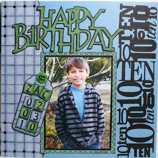
I chose to use some paper that I have had for years in order to get a masculine look for this layout marking my son's 10th birthday. The paper is from Hot Off The Press' Busy Scrapper's "Boys to Men" collection. The cool thing about these collections are that they are arranged in the book so that papers coordinate nicely and also include tags, letters and other embellishments that make creating layouts quick and easy.

The tiled paper on the left side was torn and inked, then I placed 14 black mini brads along the left top and bottom corners to accentuate the lines in the paper. I attached the pre-made tag to the layout with a Great Big Brad that I altered by adding a "Snap Shot" rub-on to the top. The letter tiles used on the tag were also from the HotP collection.

The "Happy Birthday" title came from the Beyond Birthday's Cricut cartridge and the very cool "10" border was from Graphically Speaking, a cart that I have to admit I have never used before but will use often now that I have explored all it has to offer.

Don't forget to submit your own project at Practical Scrappers. This week we will have a winner for the project that uses the most brads, a winner for the most creative use of brads, and a winner for the favorite project. The design team is looking forward to seeing what you come up with!

Thanks for stopping by and...

Happy crafting,
Barb!

Wednesday, February 3, 2010

This week's challenge at Practical Scrappers was to use a die cut machine (any type) so I chose to use my Cricut Expression. I love all the choices I have at my fingertips with my Cricut machines and cartridges.

Here's my layout for this week's challenge:

The photo has been sitting in a box begging to be scrapped since 2004 - yep, I'm a little behind. My son Zack, the little guy in the front, turns 10 today so I guess I better get that entire trip scrapped soon!

I used
Animal Kingdom for the animal blackouts and just adhered them to the page. The funky palms were cut from my Paper Doll Dress Up cartridge (cave girl) inked, cut apart and 3d dotted on for dimension. The title letters were welded in Design Studio and cut using Don Juan.

The tag was crumpled and distressed with Tim Holtz Distress inks then spritzed with a perfect pearls mixture. You can't tell in the picture but there is a little shine on the tag when light hits it - fun!

Be sure to stop by Practical Scrappers and check out all the projects that the talented ladies on the Design Team have created and submit your die cut project before Saturday at 5pm ET.

See you next Wednesday on Practical Scrappers, but I have a lot more to share in the meantime here on my blog so be sure to become a follower and visit often.

Happy crafting,
Barb!

Sunday, January 31, 2010

Practical Scrappers Friday sketch 1/29/10 (an update)

Here's this weekend's sketch from Practical Scrappers:


And here's my layout using the sketch:


I used DCWV striped paper from the "Spring Stack" for the background paper and mats. I ran the blue photo mat through my Cuttlebug using the "Tiny Bubbles" embossing folder then lightly sanded it to bring out the white core in the paper. I really like how it actually looks like bubbles when sanded!


The title letters were cut on my Cricut using Tear Drop cart, which just may be my newest favorite font cartridge due to it's whimsical playful appearance. "Bubbles" was also run through the Cuttlebug and lightly sanded to reveal the white core.


If you look closely right above the polka dot ribbon that runs across the page, there is a scalloped border. I created this by using an EK Success Corner Adorner "bubbles" punch, removing the corner guide and aligning the punch holes to create a border. By using DCWV adhesive matstack paper, the inside cuts created by the corner punch adhered flat and blended enough so they are barely seen. I'll have to experiment with my other corner adorners now to see how they look as borders.

A scattering of EK Success vellum bubbles completed the layout.


Thanks for looking and...


Happy crafting,
Barb!

Monday, January 25, 2010

I was selected as a Design Team Member!

Short and sweet announcement...

I received an email yesterday to let me know that I was one of 8 crafters selected to be on the Design Team for Practical Scrappers! My submissions will appear on Wednesdays, which will also feature Cricut / Cuttlebug projects from 5 other talented design team members.

Be sure to check us out and become a follower!

Happy crafting,
Barb!