Tuesday, February 23, 2010

SOUS 2/19 Sketch

This week's Stuck on U Sketch is another by Liz Qualman. Here is the sketch:


and here is my rendition of her sketch:


The photo is a great shot of 2 of my dad's sisters that my cousin uploaded to Facebook several months ago. I knew I wanted to do a layout using that photo and even picked out what I felt was the perfect paper for it - I just didn't know what I wanted the layout to look like. I have never done a vintage layout before but I have so many pictures that I want to scrap so I'm glad I got my feet wet with this photo and Liz' sketch.

I used Cosmo Cricket "Everafter: Something Old" paper, distressing the edges a bit with Tim Holtz Vintage Photo and Spiced Marmalade distress inks. I used the same colors of distress inks on the plain cream cardstock oversized mat to tone it down, then using walnut stain distress, I inked the edges to give it more definition. I double matted the photo with cream and butterscotch CS and inked the edge of the cream with weathered wood.

The butterscotch flourishes were cut on my Cricut with the Home Decor cartridge, then I painted a light wash of water and gold Perfect Pearls to make them sparkle ever-so-slightly. The scalloped border below the photo was cut using Accent Essentials cartridge and I placed some Best Occasions by Colorbok self adhesive ribbon between the photo and scallop edge as well as 3 self adhesive pearls (Target) for a little sophisticated vintage bling.

The tag was printed from my computer using "American Typewriter" font but I decided to format a few letters throughout the journaling to mimic the stuck keys and different keystroke pressure of an old typewriter. I crumpled then distressed the tag with more spiced marmalade and vintage photo, then gave it a misting of water & gold perfect pearls. After drying it with my heat gun, I added a little walnut stain distress to the edges and a bit on the surface to accentuate the wrinkles. The sheer ribbon added a soft and feminine look to it.

My favorite page element has to be the flowers. They are handmade out of paper. I used a fantistix and traced the outlines of the petals with vintage photo distress ink and after they were assembled I went back and painted some of the edges with a little water and gold Perfect Pearls. After I had the page together I decided to add just a dot of "Frayed Burlap" distress Stickles to the centers of the flowers.

Here's a close-up of one of the flowers so you can see the subtle shine of the Perfect Pearls and the Distress Stickles:


Thanks for stopping by and let me know what you think.

Happy crafting,
Barb!

Wednesday, February 17, 2010

SOUS 2/12 Sketch - my first submission

So, I think I'm getting a little more confident with my work. I mean I LOVE my layouts and other people seem to like them too. I just have been hesitant in submitting anything other than my design team work... until today.

I recently saw this sketch on Stuck On U Sketches:


This is a direct quote from SOUS:
"This week we have chosen one created by Liz Qualman. You can visit Liz and see more of her work at http://lizqualman.blogpsot.com/. We hope you will come back next week for a VERY special treat from Liz to us for you! You won't want to miss it! But this week we have a little TWIST on the challenge. You must use the sketch AND you must use RED or PINK on your layout! It doesn't have to be valentine-ish... just use one of those colors somewhere on your project..."

As soon as I saw it I knew exactly what I wanted to do with it! I had this amazing photo of my youngest daughter and it was perfect for this sketch challenge!

Here is my take on Liz Qualman's sketch:


The patterned papers were from HotP (striped and polka dot), Doodlebug Design (checked) and the speckled is unknown :(

I used my favorite Cricut font cartridge Alphalicious for the title letters - it just adds to the playfulness of the layout, don't you think?

Practical Scrapper's challenge for this week is flowers so I thought I would keep the theme going by using some homemade sunflowers for the embellishment.

After cutting the flower centers and stacking them, I used "pine needles" and "walnut stain" distress ink applied to a Fantastix to tap ink on the jagged edges, softening them a bit and giving them a more realistic look. Here's a close-up of the flowers:


I'm really thrilled to finally have this photo in my scrapbook where it belongs instead of in a box full of photos where nobody can see it.

Let me know what you think!

Thanks for stopping by and...

Happy crafting,
Barb!

Tuesday, February 16, 2010

Practical Scrappers DT Challenge: Use Flowers

Greetings from Southwest Florida!

Normally I would post my PS DT submission first thing on Wednesday morning (or late Tuesday night) but I've been up since 4:45am, it's relatively quiet in my house at the moment (so I can think), and I plan on plopping on the couch to watch TV tonight until I can't keep my eyes open, (although MY favorite show "The Biggest Loser" isn't on this week) so I decided to post this now.

Here's this week's Design Challenge From Practical Scrappers:

"It's cold and there's snow in 49 states (not here in SW Florida though!) but it's definitely time for a break from winter. This week we want you to use up flower supplies - you can make your own, use some primas, put a creative twist on a different supply to make flowers - whatever you'd like!"

All that said, here's my Design Team submission for Wednesday, February 17th:


In keeping with my goal of scrapping a lot of my older photos as well as my current ones, I decided to design a layout for another photo from our Disney World Summer 2004 trip. The kids and I went to the "Spirit of Aloha" dinner show at the Polynesian Resort and it was so much fun! Alyssa even got into the "Aloha Spirit" by joining other kids to learn how to hula!

The paper I used in this layout was "Aloha Chic" by STARfish Dreams, Inc. I used Tim Holtz Distress Ink in Dusty Concord to tone down the background just a tad. In all honesty, I was having trimmer issues and couldn't get a straight cut to save myself! When I finally managed to cut way too much more off the edge than I originally wanted I noticed the blade had mangled the paper's edge (urggg!) so distress to the rescue! I'm very pleased with the result.

The hibiscus flowers were cut using my Story Book Cricut cartridge as was the accent frame surrounding the photo. I accented the stamins with yellow stickles to make them pop. To embellish the white paper to the left and right of the photo, I turned to my Cuttlebug and a "Frills" embossing folder. I also used the embossing folder on the little journaling tag. The title letters were cut using Don Juan Cricut cartridge.

Don't forget to submit your own project at Practical Scrappers. This week we will have a winner for the project that uses the most flowers, a winner for the most creative use of flowers, and a winner for the favorite project. The design team is looking forward to seeing what you come up with! Even if you don't have a flower project to submit, take a few minnutes to check out all the projects that have been submitted by the design team as well as all the submissions by papercrafters just like you. I'm sure you'll find a lot of great ideas and tons of flowery inspiration!

Thanks for stopping by and...

Happy crafting,
Barb!

Wednesday, February 10, 2010

Practical Scrappers DT Challenge: Use Brads

This week's challenge at Practical Scrappers was to use brads, something we paper crafters all have and use often. Because my projects are posted on Wednesdays, I also have to use my Cricut when designing my projects - a bonus for me as I love to use my Cricut!

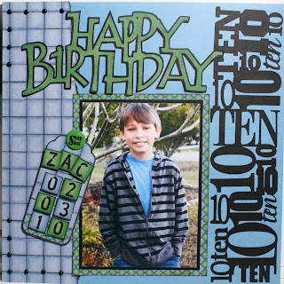
Here is my completed layout:


I chose to use some paper that I have had for years in order to get a masculine look for this layout marking my son's 10th birthday. The paper is from Hot Off The Press' Busy Scrapper's "Boys to Men" collection. The cool thing about these collections are that they are arranged in the book so that papers coordinate nicely and also include tags, letters and other embellishments that make creating layouts quick and easy.

The tiled paper on the left side was torn and inked, then I placed 14 black mini brads along the left top and bottom corners to accentuate the lines in the paper. I attached the pre-made tag to the layout with a Great Big Brad that I altered by adding a "Snap Shot" rub-on to the top. The letter tiles used on the tag were also from the HotP collection.

The "Happy Birthday" title came from the Beyond Birthday's Cricut cartridge and the very cool "10" border was from Graphically Speaking, a cart that I have to admit I have never used before but will use often now that I have explored all it has to offer.

Don't forget to submit your own project at Practical Scrappers. This week we will have a winner for the project that uses the most brads, a winner for the most creative use of brads, and a winner for the favorite project. The design team is looking forward to seeing what you come up with!

Thanks for stopping by and...

Happy crafting,
Barb!

Friday, February 5, 2010

This weekend's sketch at Practical Scrappers

Here is the sketch by Ann-Katrin for this weekend on Practical Scrappers:


And here is my layout based upon the sketch:


I used Nikki Sivils paper for the background, adhered to plain ol' black cardstock. The stickers are from Reminisce (diploma and stars), and the title was cut using Base Camp.

Easy-peasy layout but I really like how it came out!

Thanks for looking and we'll see you on Wednesday for next week's challenge on Practical Scrappers. Until then...

Happy crafting,
Barb

Wednesday, February 3, 2010

This week's challenge at Practical Scrappers was to use a die cut machine (any type) so I chose to use my Cricut Expression. I love all the choices I have at my fingertips with my Cricut machines and cartridges.

Here's my layout for this week's challenge:

The photo has been sitting in a box begging to be scrapped since 2004 - yep, I'm a little behind. My son Zack, the little guy in the front, turns 10 today so I guess I better get that entire trip scrapped soon!

I used
Animal Kingdom for the animal blackouts and just adhered them to the page. The funky palms were cut from my Paper Doll Dress Up cartridge (cave girl) inked, cut apart and 3d dotted on for dimension. The title letters were welded in Design Studio and cut using Don Juan.

The tag was crumpled and distressed with Tim Holtz Distress inks then spritzed with a perfect pearls mixture. You can't tell in the picture but there is a little shine on the tag when light hits it - fun!

Be sure to stop by Practical Scrappers and check out all the projects that the talented ladies on the Design Team have created and submit your die cut project before Saturday at 5pm ET.

See you next Wednesday on Practical Scrappers, but I have a lot more to share in the meantime here on my blog so be sure to become a follower and visit often.

Happy crafting,
Barb!

Monday, February 1, 2010

01/10 Scrapbooking Goodies' DT Challenge: Theme of your choice!

The DT challenge for January was to pick any theme and do a card or layout using products from the store... SIMPLE! Well, seeing that I am at the store quite frequently and I am the store owner Teresa's go-to girl for opinions, thoughts, suggestions and assistance she often times tells me what she would like me to do for the challenge - or even selects the materials she wants me to use. January was no exception :) Her sample layouts using "dog" themed products were very basic and limited (I think there is 1 in the store) so she asked me to do a dog layout. I think she wanted me to do a layout for our new puppy Treble, but that will have to wait.

Here is my layout for January 2010:

Left page

Right Page:

The patterned papers and stickers are from Reminisce's "Good Boy" collection - a very cool line with double-sided papers that can be used for many type of layouts - not just dogs. The masculine stripes and the rich warm colors make this collection a real winner for me.

Title letters were cut using All Mixed Up (Emily) and Plantin Schoolbook (The Destroyer) and the paw prints were cut from Mickey and Friends. Tags were cut from Tags, Bags, Boxes and More.

I think the journaling is super funny! I did it from Emily's perspective, as if she dictated her story to me and I just typed it up for her. Here's a couple of close-ups...

Left page:
Right Page:

The tags all pull out and have "evidence" photos of a few of the things Emily has destroyed. I will be changing the ribbon pulls when I bring this into the store. The sheer ribbon keeps sliding off the tags and I'm not 100% happy with the way it looks. The tags were distressed with Tim Holtz distress inks (spiced marmalade, aged mahogany, brushed corduroy, vintage photo and walnut stain - yep ALL 5 of them)

The tag holder was made by using a #10 business size envelope. I have seen this done a couple of times on a couple of blogs and directions can be found by watching this YouTube Video from Following the Papertrail. She's got a lot of very cool things on her blog... check her out when you get a chance. You won't be disappointed!


This last photo is an accordian fold mini-album that holds 7 additional photos, all tied together with a beautiful satin maroon and tan ribbon.


This 2-page spread holds 16, yes SIXTEEN photos! It was a lot of fun to make and it may be one of my favorites.

Next month's SG Design Team Challenge: "Ebony and Ivory" use Core'dinations Black Magic and Whitewash cardstock for a layout or card.

Happy crafting,
Barb!