Wednesday, August 29, 2018

It's been YEARS since I've posted anything on this blog, but I'm launching an online store and I want to have all my bases covered, lol! So, without further ado...

Please visit me at ItsYourThing.biz or if you've come to my blog from the store, WELCOME!

I'll be posting new and exciting things soon!

Monday, January 9, 2012

Welcome to 2012!

Happy belated New Year! One of my resolutions for the new year is to update my blog at least once a week - 2011 was NOT an exceptionally craft-filled year for me and I have decided that this year will be different: I WILL set aside time every week to create something handmade and use up many of the supplies that I have in my awesome craft studio.

Week one of the new year has been devoted to reorganizing my craft studio - the dream room that my ex-boyfriend Tom and I designed and he built back in June of 2010. It's taken me that long to figure out where everything should be so that I can really create in a functional space without having to look for the things I need. I finally have my "most used tools" within reach of the area that I use most as my work space. This includes my GlueGlider Pros, craft knife, craft pick, TweezerBees, my brand new Tonic Studios Scissors (how did I live without these???), Zig 2-way Glue (all sizes),  Zig Millennium Pens, rulers, stickles, paper trimmer, bone folders, crop-o-dile, zots, red-line tape, foam dots, Prima flowers, Heat It gun, sanding blocks, Copic Markers and other tools I use frequently when I craft. A few years ago I had bought a locker shelf for one of my daughters - it never was used so I put it to work to help organize this space, as pictured below:


I also have a spinning rack that was purchased for bottles of acrylic paint, but I repurposed it to hold my Adirondack acrylic paint dabbers, glimmer mists, Perfect Pearls mists, Distress stains, and ModPodge bottles:


Below my most used tools are those cool storage cubes you can find at most craft stores. I have them stacked two high and 5 across and they hold loose single sheet patterned papers, card stock and assorted embellishments. I find it very useful to have these products within reach when I'm working.


Tim Holtz Distress inks are all neatly stored behind my non-stick craft sheet and the handy Ranger Inkssentials Craft Spinner Ink Blending Tool Storage rack which holds labeled blending tools for each color family:


The little shelving unit above also houses my embossing powders, inks and assorted stamping products.

Across the room are 2 pegboards: one holds embellishment products such as Tim Holtz idea-ology products, gemstones and other bling, grungeboard, boa trim, Jolee stickers, metal charms and the like:


The second pegboard is actually a garage type workbench with a lighted hutch top. It was hanging out in my garage doing absolutely nothing so it was moved into my craft studio where it now holds my other not-so-often used tools like decorative edged scissors, alcohol inks, shaped brads, hot glue guns, painters tape, magnets, distress paint, as well as backup supplies like Zig 2-ways, replacement blades and perfect pearls. I know where they are when I need them, but I'm no longer sorting through everything to find just what I need most often.  This works exceptionally well for me. The bottom half of the workbench is divided into two units: one is a two-door shelved cabinet and the other is a 3-drawer unit that organizes my painting supplies, polymer clay supplies and my "F" drawer that holds my fake fur, felt and feathers :)


That's just a small part of my craft studio tour - tomorrow we'll explore a little more of my creative space, and (hopefully) I can share another resolution that I'm working really hard to make happen :)

Thanks for visiting and...

Happy crafting,
Barb!

Sunday, July 17, 2011

UTEE flowers

It's been forever since my last post, or at least it seems that long. I've been in a creative funk lately, but I think I've been able to shake it and get back to what I love to do, craft!


I was checking out YouTube videos looking for paper flower tutorials when I came across a video that caught my attention (here it is). "Faux Porcelain Flowers" by Sherry Cheever, I was intrigued... I watched that video a few times, and kept thinking, how cool would the flowers from the Mother's Day Bouquet Cricut cartridge look done in the same way. I had seen jars of UTEE (Ultra Thick Embossing Enamel) in craft stores and a local scrap shop or two, but never really knew what to use it for. I have embossing powders and don't really use them very often, so I figured this was just a more expensive embossing product that I wouldn't use - oh was I wrong!


I printed off my AC Moore coupon and off to the store I went to pick up some UTEE and a Melting Pot. ACM had the UTEE (which I bought), but didn't have the Melting Pot, so I cruised on down to Michael's and found it there. 


Enough story telling, here's my first UTEE project:


Aren't those flowers fun? Here's how I made them:


Pour some UTEE into the Melting Pot


And watch it melt... You should cover the pot with the lid provided, it will speed up the melting process.


While the UTEE melts, give your paper pieces dimension by using an embossing stylus to either make lines in leaves, or as I did in the layers pictured below, go along the back side of the paper in a circular motion along the edges of each petal. This will make the petals curl. I also rolled the yellow layer's pointed edges over a bamboo skewer to make them curl.


Once you have the petals formed and your UTEE has melted, drop them into the pot and swirl them around to make sure you have coverage on all sides. 


Be sure to flip your pieces over :)


Take the UTEE covered pieces out and let them cool on your non-stick heat-resistant craft mat (a "must have" for this technique!) Note: the UTEE doesn't dry clear, so expect some yellowing of your pieces. I used very bright colors and the finished project doesn't look too bright.


After the pieces have cooled, stack them together in a way that looks good to you. When you have them in the right place, hold them together with a skewer and using your heat gun, re-heat the stack. 


As you can see in the picture below, the layers will melt together and become attached.


Even upside down it stays together :)


Now, I have to say that for one of the flowers, I had to use a hot glue gun to keep the center attached. It worked great!


The picture below was the first flower I made - my very first UTEE project. I love how it came out. The cartridge I used was the Mother's Day Bouquet.


Here's a close-up of the flower grouping. 


I used Tim Holtz corked vials filled with sand and teenie-tiny shells we found that day on the beach.


The base of the wall hanging was cut from the Lacy Labels Cricut Lite cartridge cut as large as it would fit on my mat. I used my Gypsy to change the dimensions (height/width) slightly and then made a second one slightly smaller so I would have a nice border. I used Colorbok whiteboard for the base, but I also used Colorbok chipboard underneath it, which I had to cut by hand as it's just too thick for my Expression to cut. 


Papers I used were "Backyard Splash" by American Crafts (waves) and "Caribbean" by Reminisce (the "Paradise" collection). The dotted paper for the photo mat was from an older DCWV Summer Stack.


I have to admit, the layout was scraplifted from Sherry as well (she's awfully talented!) 


Thanks for stopping by and...


Happy crafting!
Barb

Saturday, February 26, 2011

Fabulous & 50 Blog Hop - TODAY!!!

Hi and thanks for stopping by!


If you are here for Angie's Paper Passion's 50th Birthday Blog Hop and you have just come from visiting Michelle at http://paperaffair.blogspot.com/ then you're in the right place! If you've just happened across my blog and would like to play along with our fun hop, you can go to http://angiespaperpassion.blogspot.com/ and start at the beginning.


Here is the complete list of participants to help you on your way:


Angie - http://angiespaperpassion.blogspot.com/
Dawn - 
http://scrappyrn-scrappyrn.blogspot.com/
Janice - 
http://www.cricutconfessions.com/
Normea - 
http://mmdezigns.blogspot.com/
Nancy - 
http://lanancyworkshop.blogspot.com/
Michelle - 
http://paperaffair.blogspot.com/
Barb - 
http://craftinginparadise.blogspot.com/ <- YOU ARE HERE!
Debbie - 
http://www.debseclecticthoughts.blogspot.com/
Marcia - 
http://scrappin-times.blogspot.com/
Veronica - 
http://www.iteachscraps.blogspot.com/
TinaGale - 
http://tiggersscrapplace.blogspot.com/
Monique - 
http://mixonthememories.blogspot.com/


My birthday project for the blog hop is a fun way for my beautiful daughter Ashley to organize the photos from her 21st birthday trip we took to Key West Florida last month - what a blast we had!


The inspiration for this mini came from Kathy Orta's Paper Phenomenom - Kathy is one talented lady!!! 


Here's a photo of my take on Kathy's mini:
I haven't embellished it or added photos yet because I want to see which photos Ashley wants to include. 


I used papers from Paper Pizazz "Retro Sarapapers" for the inside pages, Glimmer papers for the title letters ("Happy Birthday"), and the cardstock used on the tags and box are ProvoCraft Accentials. Cricut cartridges used were Tags, Bags, Boxes and More, Alphalicious, and Forever Young (these cuts are not pictured) to cut some fun phrases that Ashley can add to the appropriate photos. 


Here's additional views of the mini:


I will post more pictures after the mini is completed with the embellishments and bling by next weekend. I hope you can stop by again to see the completed project :)


I hope you like my project & will become a follower of my blog.


If you would like to see a YouTube video on how to make your own paper bag mini like this, go to http://www.youtube.com/watch?v=YgOCLtAJxw4


If you are continuing on to the next stop in the Fabulous and 50 Blog Hop you can get there by clicking here.


Happy birthday Angie!!!


Have a creative day!
Barb

Tuesday, February 22, 2011

Fabulous & 50 Blog Hop


I've been MIA for almost a year (YIKES) but that doesn't mean I haven't been crafting :) 


My Cricut Demo Army friend Angie is celebrating her 50th Birthday on Saturday, February 26th with a "Fabulous & 50 Blog Hop" and I'm honored to be one of the 12 blogs in the hop. I hope you stop by and check out the crafty birthday projects these talented ladies have created.


Have a creative day,
Barb

Wednesday, May 12, 2010

Practical Scrappers DT Challenge: Punches

The challenge this week at Practical Scrappers was to use punches. Since the purchase of my Cricut machines 2 years ago, my punches see more dust than action however my collection of circle Paper Shapers by EK Success are truly my "go-to" tools on a regular basis.

My "Hope Rocks The Beach" layout is a very simple page, with lots of photos from a fundraiser on Fort Myers Beach that I co-chaired a year and a half ago. I used a photo collage template from Scrapbooks Etc to include a bunch of pictures but still maintain a clean design.


My circle punch was used for the number labels that correspond with the numbered list on the right of the LO. I feel horrible when years after taking a picture, I forget the details, so by listing everyone in this manner, I can remember all the FABULOUS people who stepped up to help out a good cause (and had a lot of fun doing it!)

That's all for this week, but come back and visit next Wednesday to see what the DT has in store...

Happy crafting,
Barb!

Monday, May 3, 2010

One of my fave LO's

On Practical Scrapper's message board, there is a Question of the Day thread asking to share/show your favorite scrapbooking page that you've done that shows a little bit of your style and tell us why it's your favorite. Sounds like a good excuse to post one of my favorite layouts that I have ever done.

Here it is:


I used the menu/mask from the photos as a template for the paper-pieced parrot on the left page. The title "my keets" is short for "parakeets" which is what the children of Parrot Heads are called, is just letters that I drew and cut by hand (this LO was done BmC... Before my Cricut). The beak is yellow card stock that I chalked to give it dimension. On the right edge near the tip of the beak, I wrote lift here... this will reveal my hidden journaling. Because the layout is about a trip to Orlando's Margaritaville, the story is written using Jimmy Buffett song titles (ALL GREEN CAPS) and is shaped like the beak! Here is the journaling:

Hoping to BRING BACK THE
MAGIC, the kids and I decided to
TAKE ANOTHER ROAD to go
Christmas shopping. CHANGES IN
LATITUDES CHANGES IN ATTITUDES
was something this family certainly
needed. A HOLIDAY in Orlando would
surely make us feel like BAREFOOT
CHILDREN IN THE RAIN. In my quest
to be INCOMMUNICADO, I left a
message on my answering machine:
“BABY’S GONE SHOPPIN’. Leave a
message after the beep.”

We spent a SUNNY AFTERNOON having
a blast SPENDING MONEY (remember I
USED TO HAVE MONEY ONE TIME).
After an entire day of LIVIN’ IT UP we
realized we were hungry, so we headed
to MARGARITAVILLE for a
CHEESEBURGER IN PARADISE. We
knew that COME MONDAY it would
be back to our CARNIVAL WORLD,
which made us WONDER WHY
WE EVER GO HOME. I know
it’s CLICHÉ but don’t we all
want to live HAPPILY EVER
AFTER (NOW AND THEN)?

Although it’s really a
SEMI-TRUE STORY I’ll
end with THAT’S MY
STORY & I’M
STICKIN’ WITH
IT!

On the right page, I used the Margaritaville logo behind my kids as inspiration for the sunset / palm trees paper-piecing. Again, lots of chalk was used for the sun. The title letters for "Margaritaville" was copied from my late husband's favorite t-shirt - a margarita spilling out forming the letters. I outlined each letter with a black glaze pen, added white glaze pen highlights and cut around the entire word. There are spots that I found too intricate to cut out, so I colored them in with black marker, but you really have to look closely to see it.

Hope you like it and thanks for stopping by!

Happy crafting,
Barb

Wednesday, April 28, 2010

Practical Scrappers DT Challenge: Use Buttons

This week at Practical Scrappers, the challenge was to use buttons... not one of my favorite things - in fact I have NEVER used a button on a layout and probably never will again, it's just not my thing. I have seen many BEAUTIFUL layouts that have included buttons, it's just not my style I guess.

On to my layout...


The papers are Reminisce's Stripestock Collection and is called "Denise". I felt the colors worked for the photos I chose.

The flowers are Mulberry Street by Petaloo and the buttons are from Hot off the Press. I tied embroidery floss in the buttons to give them a finished look. The ribbon "stems" is just from a spool that's been hanging out in my supplies stash for longer than I can recall.

The phrase was cut on my Cricut using the Alphalicious cartridge.

Thanks for stopping by my blog.

Happy crafting,
Barb!

Wednesday, April 14, 2010

Practical Scrappers DT Challenge: Use Glitter / Bling

Hey there! Thanks for stopping by my blog!

I had to skip last week's DT challenge, but this week's challenge at Practical Scrappers was to show your projects that feature glitter, bling, jewels, pearls...all that fun girly stuff! The winner will get their choice of five digi-stamps from Creations by Penny. The deadline to enter is 5 pm ET on SUNDAY.

I had the pleasure of going to the Upper Keys / Islamorada Florida with 2 very good friends of mine to celebrate our birthdays last week. We spent 3 days in the sun, so I decided to use that as the focus for my DT project this week!


We're kind of goofy, fun-loving, VERY friendly girls so we decided to buy a tacky pink plastic flamingo and ask everyone we met to sign it. We called the flamingo "Holiday" as we were on holiday AND we were at Holiday Isle Beach Resort & Marina when we got our first "autograph" (see how goofy we are?)

Okay, back to my project... The PP was from Flair Designs' Paradise Collection and is called "Jungle Fever" - LOVE IT!!!!! As in almost every LO I do, I mounted the PP to CS, but this time I dug deep into my stash and pulled out ancient "Paper Adventures 2-Tones" CS that I purchased WAY back in 2003! These papers were amazing and I wish these babies were still around today. It's sort of like Core'dinations where the front and back are coordinating hues, but with a felt-like texture. Have I mentioned I love paper??? The color was called "Bubble Gum" and it's as yummy as a big hunk of Bazooka!

The flamingo was cut from Core'dination cs (fuscia) using Life's a Beach "fit to page" mode on my Cricut Expression. I did the usual layering and decided it needed more. Way in the back of my "everything else" stash drawer, I had a bag of bright pink feathers (why???) and they were perfect for my flamingo. She's kinda cute, right?

The title letters (Alphalicious) were welded with the sun (Cricut Office Help cartridge) in Design Studio and then layered and adhered together with shadows. I applied Stickles to the letters (fruit punch) and the sun (yellow) for the glitter challenge requirement.

I added a Kaisercraft rhinestone word ("FUN") centered on the bottom of my photo, as well as a few pink rhinestones in 2 of the photo corners for some bling.

There it is... a layout almost as fun as our 3 days in the sun!

Thanks for stopping by my blog. Leave a comment if you like my layout and PLEASE become a follower if you are not one yet... I'll return the favor!

Happy crafting,
Barb!

Wednesday, March 31, 2010

Practical Scrappers DT Challenge: Use Rub-ons

This week's challenge at Practical Scrappers is to use rub-ons - something that I, admittedly, am NOT a fan of. I bought some to use for the challenge and didn't end up having time to create a layout around the rub-ons - which is what I would have to do in this case. I had been working on scrapbook layouts with non-scrapping friends last week. We started on Monday and needed an entire book done before Friday - it was a moving away gift for a family that are dear friends of mine and Will (the husband) was leaving on Tuesday morning, so his surprise going away party was on Friday night.

On Friday while working on a "Friends" page and cooking up a huge batch of gumbo for the party, I decided to use some old rub-ons that I've had for a while on the layout, which I was able to submit as my project. Talk about getting it done on the 11th hour!

Here is my 2-page layout "You've got a friend in me".

Left page:

here's the right page:


The left page has an oversized tag cut from tags, bags, boxes and more. I printed the lyrics to the Randy Newman song "You've got a friend in me" (we all know it from Toy Story) and used that as the journaling tag. I knew this going away party was going to be emotional and our friend Will needed something to remind him of his friends here in Florida. I didn't want the journaling to be too personal - he's a tough guy, so I opted for this song. The photos on the layout were from various times we all spent together at a bar where Will's wife (and one of my best friends) Krissy works. My boyfriend plays guitar and sings there on Sundays so the music theme seemed appropriate. It went over well - and there were a lot of tears.

On the lower right corner of the left page, there is a mini album, which is held closed by sheer yellow/gold ribbon tied in a bow. It's folded accordian style and houses 7 photos between the 2 sides of the pages. Here's a close-up of it opened:


The right page also holds a bunch of photos, but this time I used a tag holder that I find quite handy, unique and fun! I've used both of these multiple photo LO techniques on a previous layout (Emily the Destroyer) but both LOs look so different - it's just a great way to get a lot of photos on a 2-page spread.

The tag holder was made from a #10 business size envelope that was folded, inked, & covered with coordinating paper. It holds 4 tags and each has a photo on both sides. I discovered this technique by visiting Following the PaperTrail. Laura has a lot of very cool things on her blog... check her out when you get a chance. You won't be disappointed! Here's a link for a YouTube video with directions on how to make the tag holder.

Here's a close-up of horizontal tags that slide into the tag holder:


and here is a close-up of the vertical tags that slide into the top of the tag holder:

Keep in mind, more tags can be added, I just chose to have 4 double-sided photo-tags for this layout. The final photo count on this 2-page layout: 18! Had I chosen to make the journaling tag a lot smaller I certainly would have been able to include at least 1 more photo on that page. In fact this layout had the potential to hold well over 20 photos without crowding them all in - gotta love that! I used Great Big Brads from Hot off the Press with quirky little HotP rub-ons on 2 of the photo tags and 1 on the journaling tag. The tags were all distressesd with Tim Holtz distress inks (spiced marmalade & dried marigold).

The striped paper was from Reminisce. It's double sided - the quilt-pattern you see under the vertical tags is on the reverse side.

Title letters were cut from Alphalicious, the music notes were from Hannah Montana and the tags were all TBB&M.

That's it for this week. I'll be celebrating my birthday this weekend so hopefully I'll have a few funny pictures to scrap in the coming weeks. My mom is doing her annual Easter Egg hunt on Sunday for the kids so there's another photo-op!

Thanks for visiting my blog and be sure to check out Practical Scrappers to see the great rub-on projects my DT sisters have created this week.

Til next Wednesday...

Happy crafting,
Barb

Wednesday, March 24, 2010

Practical Scrappers DT Challenge: Use something that you've had in your stash for over a year

Spring is here so it's time to clean out your storage bins & drawers, dust off those packages of stickers that you HAD to have but never used and use up those patterned papers that you've been holding on to for that special page!

This week Practical Scrappers wants you to dig into that stash and use something that you have had for over a year. It can be a product or tool and you only need to use one item to qualify. The Grand Prize winner will receive two free digi stamps from The Stamping Boutique. The deadline to enter is 5 p.m. on Saturday, so hop on over to Practical Scrappers and submit your project. My Design Team sisters and I would LOVE to see what's been hiding in your stash!

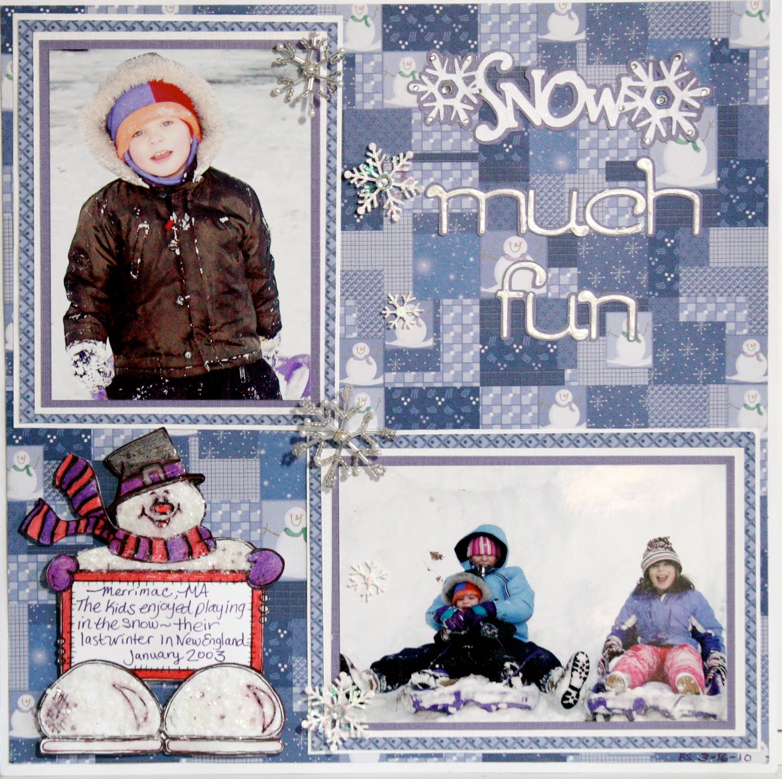
Here's my "Snow Much Fun" layout for this week:

I have had these papers from Hot Off The Press' "Mixing Christmas Papers" since 2002 and it's really great to use them! I wanted to bring in a little purple from the photos and the patterned paper so I matted the 2 photos in purple, then white, then a coordinating HotP paper from the same collection and finally another white mat. I felt that because the geometric pattern on the paper was so busy, the quadruple mats helped to tone it down, while still tying it together.

The glitzy snowflakes cascading down the layout are from Jolee's Boutique - another item that has been floating around in my stash since about 2003. I love how well the silver & pearl beads and clear rhinestones play with the cool blues and purples of the papers.

Because this month's sponsor is The Stamping Boutique, the DT members all were asked to use a digi stamp on a card or layout during the month. I chose an adorable Snowman Scrapbook Journal, which helped me do another snowy layout from our old home in New England. I colored the happy fellow with colored pencils, then applied Glossy Accents on him. While the Glossy Accents was still wet, I sprinkled a healthy dose of Martha Stewart Crafts "Snow" glitter all over to give him a frosty look. This glitter is a lot chunkier than normal glitter so it does look like ice crystals - take a closer look:


After the first coat of glossy accents dried, I applied more to his hat, scarf & mittens as well as along the exposed edges of the journaling block and the bottoms of his feet. I cut the entire digi stamp out and used 3d foam dots to affix him to the page.

The title letters ("Much Fun") are from the Tear Drop Cricut cartridge and were welded using my Gypsy and "Snow" is from Gypsy Wanderings. I applied Liquid Pearls White Opal (I've had since '08) to the tear drop letters and Distress Rock Candy Stickles to the "Snow" title. I also added some additional rhinestone bling on the snowflakes for a little extra sparkle.

I think I'm done with snowy layouts for a while. The sun is shining here in Southwest Florida and it looks like we're back to our normal 80 degree temperatures for a while... sounds like there may be a few beach days with my girlfriends along with some bright beachy layouts in the coming weeks!

I hope the sun is shining, the snow is melting, the rain has stopped and the crocuses are popping up where you are! Thanks for visiting my blog and...

happy crafting,
Barb

Friday, March 19, 2010

Practical Scrappers Sketch Friday (March 19)

This week's sketch at Practical Scrappers comes from the very talented Ann-Katrin. I LOVE her work!!! Here is her sketch:


And here is my "Rock Out' layout based upon her sketch:


I did take some artistic freedom with the sketch as you can tell... I omitted the horizontal and vertical paper strips because it just wouldn't work with my background paper (DCWV "Rockstar Stack") or my Cricut cuts.

The entire layout was designed and welded in Cricut DesignStudio, which made placement of the photo and all of the paper-pieced die cut layers SOOOOOO simple and precise! I used the Hannah Montana Cricut cartridge for the funky guitar and the word "ROCK", George and Basic shapes for the photo mat, Home Decor and Home Accents for the swirls. and Black Letter for the letters "OUT". You may not be able to see in the picture but I inked the edges of the "Rock Out" letters with "Tattered Rose" Distress Ink and the guitar with "Broken China" Distrss Ink. I love the contrast between the tattered rose and yellow CS (in real life).

The photo is my DD Alyssa when she was about 4-years-old... she's going to be 17 next month - Guess I'm a little behind on my scrapping, LOL!

Thanks Ann-Katrin for another AMAZING and INSPIRING sketch layout. I can't wait to see what you come up with next, and thank YOU for visiting my blog. Please leave a comment and become a follower, if you are not one yet!

Thanks and happy crafting,
Barb!

Wednesday, March 17, 2010

Practical Scrappers DT Challenge: Use Chipboard

This week's challenge at Practical Scrappers is to use Chipboard. I had originally planned to submit my Cruise word book, but I didn't have the photos that I needed to complete the book in time. The layout below is my "Plan B":


I have a confession to make... I'm not a huge fan of manufactured shaped chipboard pieces. I own a lot of it, in fact, I have a lot of these Technique Tuesday full sheet sets, but I can't seem to take them out of the packing and use it. This wave has been floating around my craft room forever!

I used acrylic paint to cover the large wave from Technique Tuesday's "FUNdamentals of Water" Chipboard
in my layout above, then added Dimensional Magic to give it some shine. Before it was dry, I added some clear glass beads to replicate bubbles.

The chipboard piece in the upper left corner is also from Technique Tuesday. I inked the outside frame, stamped the "Life's a Beach" on the inside and then traced over the stamped words with Stickles.

The date tag was made from leftover chipboard using a template that I made from tags, bags, boxes and more and my Cricut. I inked the edges, used Stickles to write the date and then attached fibers to the ends to anchor the tag on my layout.

The paper is one of my favorites... it's from Flair Designs and it's called "Paradise Found" - fun, fun, fun!!!

Thanks for visiting and...

Happy crafting,
Barb

Tuesday, March 16, 2010

Cruise Word / Shape Book

I am submitting this Word / Shape book as an additional Practical Scrappers project for the Chipboard Challenge:


This is a book that I made for my Cricut DesignStudio 102 class that I will be teaching later this month at Scrapbooking Goodies in Cape Coral FL. In this 2-part class, I will be showing students how to create their own unique word / shape book. This is an example of one of the many different formats that they can use and I will have other types on display at the store so they can decide which type they would like to make.

The cardstock is all Core'dinations and I chose that because of it's thickness - something that I think is very important for these shape / word books. I used recycled cereal boxes and Pepsi can 12-pack boxes for each page, spraying each piece with Archival Mist to make it acid free. Each page was cut twice from CS and once from the recycled box "chipboard".

The first page is the welded title letters for the book - in this example "Cruise". I used George for the rectangle on the left side of the page, and Life is a Beach for the letters and wave. I used a new type of Core'dinations for the wave - "Gemstones"... be sure to look for these beauties at your LSS!


The second page is pockets that hold tags that I made from tags bags boxes and more and my ship credit card. You may not be able to tell from the photo but there are actually 2 rows of pockets. The back side of every page (not shown) also have "Gemstones" waves that act as a pocket for photos or tags.

Page 3 is a cruise ship from Life is a beach (LiaB). Simple page, no real plans for photos or journaling, but they could be added.


The next page is dolphins from LiaB - again, nothing special here except flipping an image, adding some welded circles & rectangles so there isn't so many cut-out areas and basic layering / paper-piecing. I wanted more uncut areas on the back to hold more pictures / journaling tags.

Here are the happy dolphins:


I decided to add a full page after the dolphin page with a beach and palm tree. The "beach" is another pocket. If you look closely you will see a new product that I just had to try - Mudd Puddles! You can get more information from their website, but it is pre-mixed glue and sand that you spread with a knife on your project, just like frosting a cake. Once it is dry, it will not crack, flake, or peel off and it's extremely flexible PLUS it's acid-free... very cool stuff!

I used 2 different colors on this page: Malibu (sand) and Marine (water).


Finally on the last shape page I used more Mudd Puddles on a sandcastle cut from Everyday Paper Dolls. This time I chose "Bahama Beach" sand and after it dried, I inked the edges with some walnut stain distress ink applied to a fantastix, as well as adding a few faux shadows on the turrets and towers.


To finish the book off, I ended with a blue full page that I can adhere photos to.

Thanks for visiting my blog. Please leave a comment and let me know what you think about my book.

Happy crafting,
Barb

Wednesday, March 10, 2010

Practical Scrappers DT Challenge: Use a white pen

This week Practical Scrappers wants you to get out your white pens/markers and use them. They will have a Grand Prize Winner again that will get two digi stamps from The Stamping Boutique.

My personal favorite white pen is Inkssentials Opaque Pen (I use them quite often) and this week I had a lot of fun doodling with it.

Here's my DT submission for this week - "Snow Day"


I have to thank my boyfriend Tom's Aunt Ann for sending him some spectacular winter photos from her home in New Jersey. As soon as I saw this photo, I knew I had to scrap it. Growing up in southeast New Hampshire and moving to northeast Massachusetts as an adult, I remember storms like this well and to be honest, I was never a big fan of snow. I remember always thinking as a child that my parents were living in the wrong part of the country. Watching Rex Trailer's "Boomtown" every weekend and hearing all about the wonderful February Vacation trips to Florida with Rex that our family could never afford (one of the show's sponsors was a travel / tour company) convinced me that I should have been born in Florida. 30 years later I finally made it "home" to Florida where we never have to shovel snow. I've often said scenes like this photo are perfect - in a postcard or a calendar, but now I think they're best in a scrapbook layout!

Back to my layout... The cardstock I chose to use is Core'dinations Black Magic Amulet, Whitewash Cellar Door, and Core Essentials Marine Blue.

Starting with the black magic, I sanded the edges to reveal the "Amulet" blue core color. I matted the photo on white CS which I then placed on a larger piece of Marine Blue that I had added torn and layered peices of whitewash cellar door. I love how the blue torn edges give the effect of piles of snow! I decided to overlap a torn piece of the whitewash on top of the photo to tie it all together.

After adhering the oversized photo mat on to the black magic CS, I doodled icicles on the top edge of the mat. When I was happy with their appearance, I added some Ranger Glossy Accents (LOVE THIS STUFF!) to give them more of an icy look. Because I didn't want the icicles just dangling there by themselves, I anchored them by applying Ranger Liquid Pearls in White Opal above them, replicating the snow on the roof. Below is a closeup of how that looks. Notice that the Liquid Pearls is on both the mat and the background CS because I wanted a bumpy edge - just like snow drifts:


I used the white Inkssentials pen for my journaling on the right of the photo. I'm not thrilled with the way it came out, but because of the texture in the CS, it really couldn't have been much better. To add to the winter scene, I doodled random snow flakes on the black magic CS and added some doodled white dots to create the illusion of falling snow in the distance.

The large snow flakes were cut using the "When it's cold outside" seasonal Cricut cartridge and the title was cut from Winter Woodland cartridge. I added Distress Stickles in "Rock Candy" to the snowflakes, including the small one in the title, to further the glistening snow effect. I like the way Distress Stickles aren't as glitzy as regular Stickles...they have a subtle appearance yet offer a dramatic impact - well done Tim Holtz / Ranger! I added the large snowflakes to the layout using 3d foam dots for dimension:


Make sure you share your white pen / marker projects with us at Practical Scrappers. We'd love to see how you use these tools! And leave a comment here on my blog to let me know what you think of my icicles - it's been a while since I've seen real ones :)

Thanks for visiting my blog and...

Happy crafting,
Barb

Friday, March 5, 2010

02/10 Scrapbooking Goodies' DT Challenge: Black Magic, Whitewash & Core Essentials Core'dinations

For February 2010 the Scrapbooking Goodies Design Team challenge was to use Core'dinations Black Magic, Whitewash and Core Essentials cardstock on a layout or card, but the REAL challenge was to use as many different techniques as possible with the cardstock: antique it, sand it, tear it, emboss it - don't JUST use it as CS.

With all that in mind, here is my layout using all those techniques, with one additional trick "sanding using a template" added in that I will explain a little further in this post:

The CS colors I chose for this layout are Whitewash Window Pane, Whitewash Cellar Door, and Core Essentials Marine Blue. I did another non-related layout using Black Magic that I am submitting for next week's Practical Scrappers' DT challenge but I can't go into the techniques I used on that page until Wednesday...

To create the background image, I cut a road sign from my "Street Sign" cricut cartridge at fit to page. I used a repositionable adhesive to keep the shape in place on the Whitewash Window Pane CS and sanded around the outside edge of the paper, leaving just the sign shape as white and revealing the black core along the outer edge (additional technique: sanding using a template). To give the shape of the road sign more definition, I traced the outline with a Zig Millinnium black marker. I felt that it made it stand out better.

To give the photo mats a little variety, I ran Whitewash Cellar Door CS through my Cuttlebug using a D'vine Swirls embossing folder, then I sanded the embossed areas to reveal the blue core (technique: embossing).

The subtitle letters (headin' down) were cut on my cricut using the Sans Serif cartridge and the title letters (US1) were cut using Street Sign. "Wish you were here" is a phrase from the Going Places cartridge.

The oversized mat was done by tearing and layering whitewash Cellar Door and core essentials Marine Blue CS. The tag was created by adhering scraps of the embossed, and torn CS as well as a small scrap that I crumpled up, smoothed out and then sanded (technique: antiquing) to a store bought tag. A scrap of sheer ribbon was looped through and the tag was 3d Foam dotted onto the layout.

While this layout is simple and basic, it does show a lot of different uses for Core'dinations cardstock. Check back on Wednesday to see another layout using Black Magic, Whitewash and core essentials CS.

With the DT submissions all in at Scrapbooking Goodies, it is now time for the store customers to take the challenge. We're challenging the customers to bring in their Core'dinations project using as many techniques possible with these 3 types of CS. One lucky customer will win a package of Core'dinations CS from the store. No email or online submissions accepted - in-store only.

Next month's SG DT challenge is Embossing - dry, heat, Cuttlebug, whatever...

Thanks for stopping by and...

Happy crafting,
Barb